Action, interaction, activation…

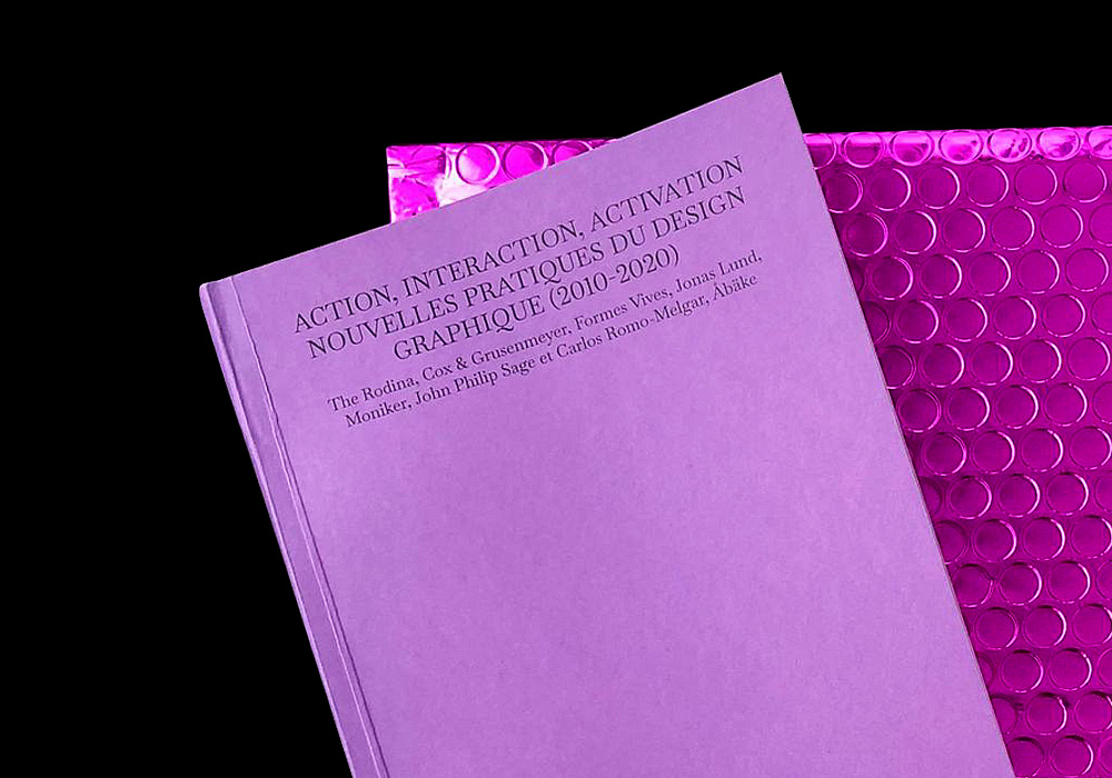
. master thesis 2021
. 13 x 19.5 cm
. 236 pages
. 7 copies


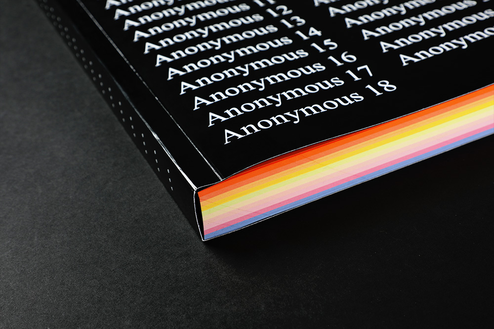
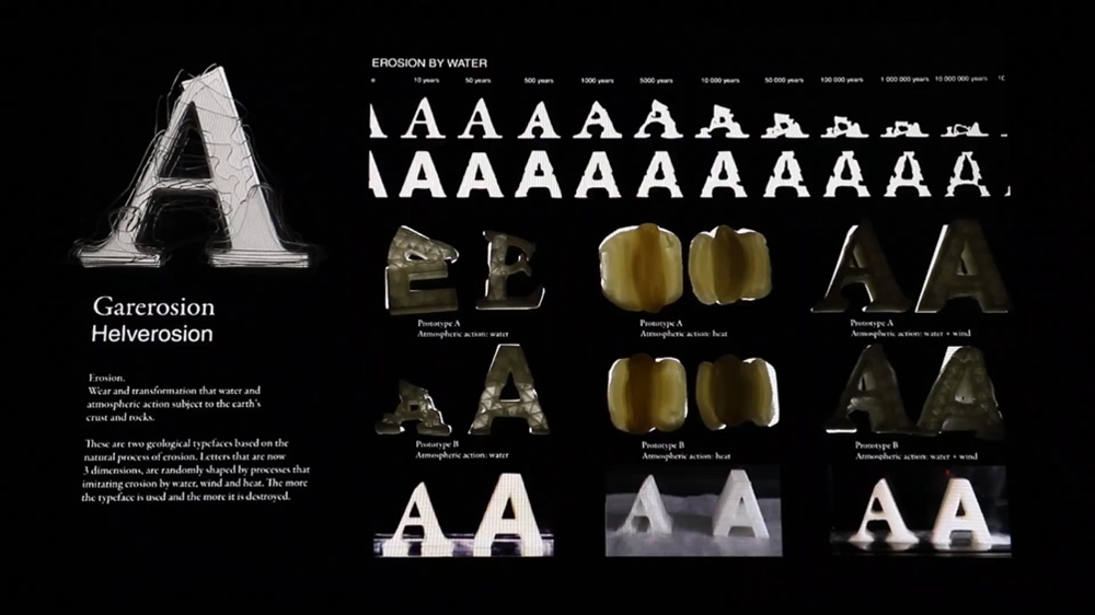
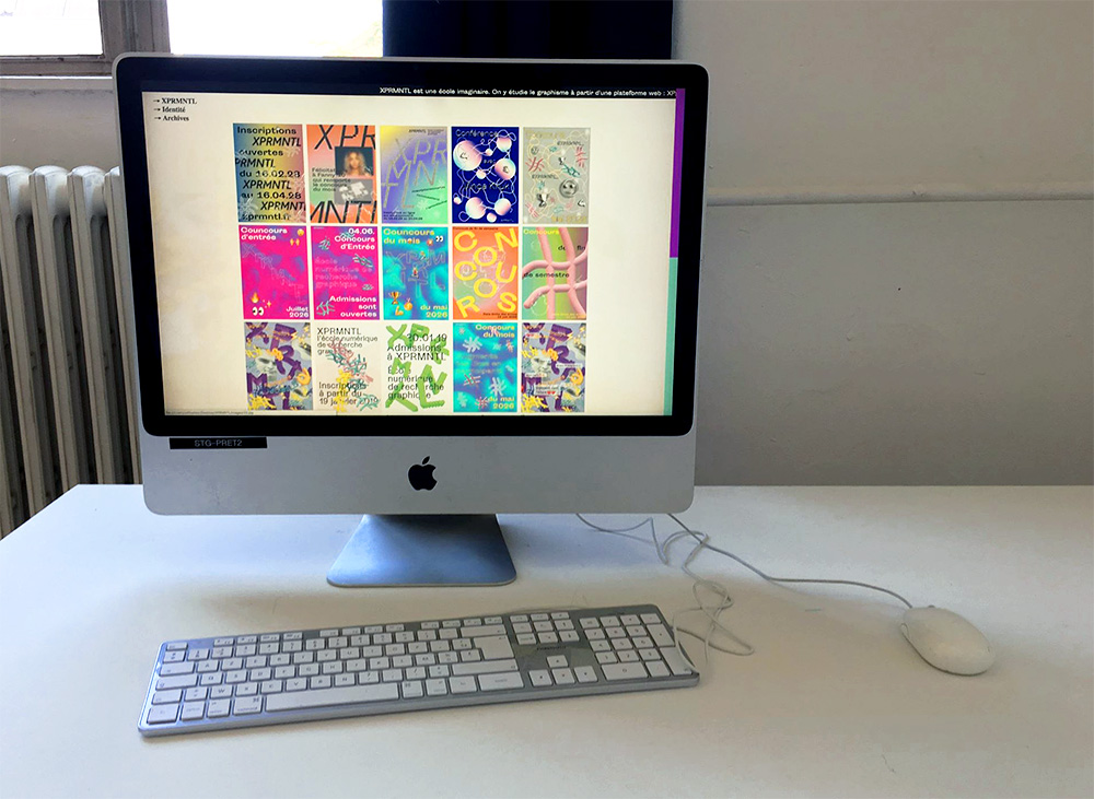
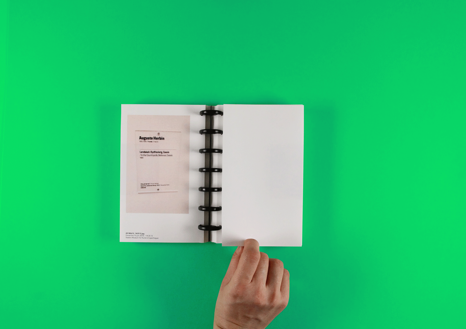
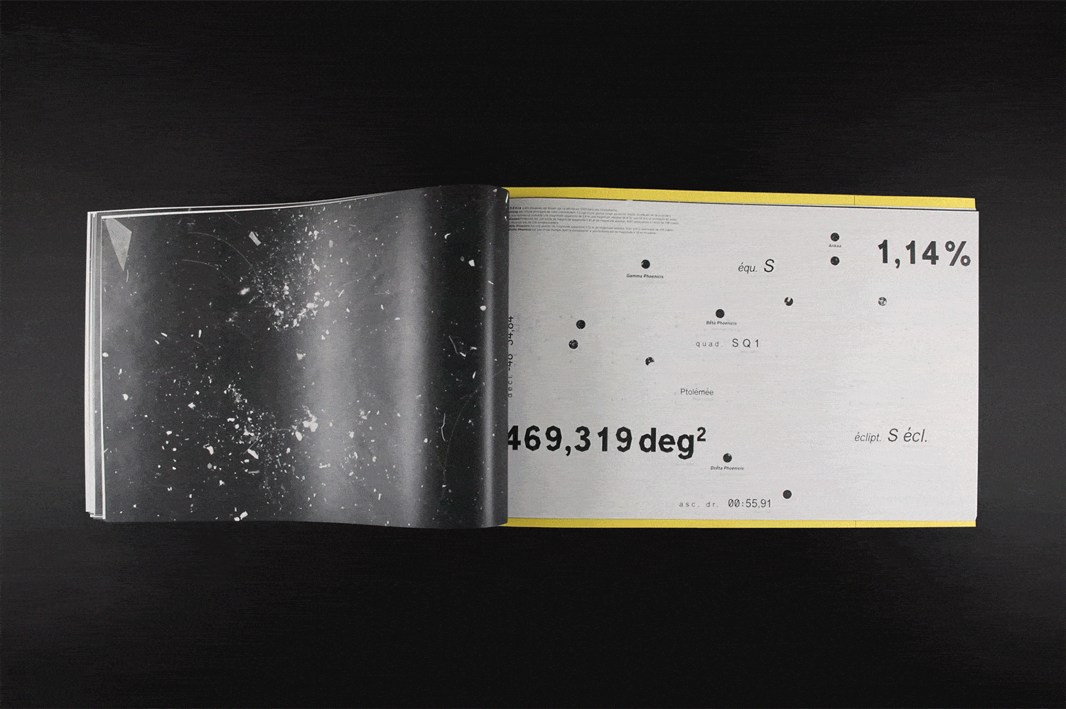
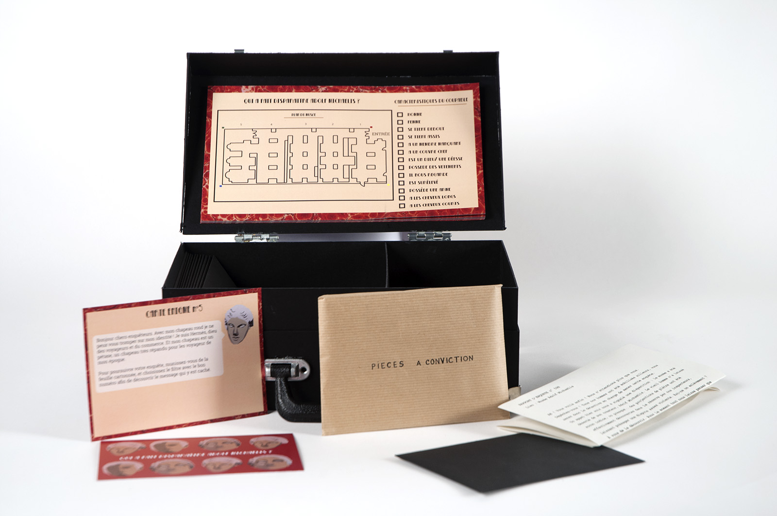
Between 2010 and 2020, performance entered the graphic designers’ toolbox. This thesis explores the forms and challenges of performance in graphic design through cases, all European, of different studios and relatively recent collectives, without forbidding the observation of artists from the field of contemporary art who are also practicing graphic design. This survey, whose territory will certainly expand in the coming years, offers a broad historical definition of graphic design. This thesis produces a typology intended to map the functions of performance in these practices as well as the different modes of relation to the spectator with which these studios and artists work. This study covers works dedicated to questioning the socio-economic conditions of existence of contemporary graphic designers, going through productions turned on one side towards a graphic design intended for citizens and on the other towards digital interfaces questioning then the place of the latter in our spectator practices, and by projects setting up protocols with instructions in order to reveal emerging behaviors. My thesis therefore aims to explore how performance seems, today, to constitute a new reflective tool for certain practitioners of contemporary graphic design.


Action, interaction, activation — Nouvelles pratiques du Design graphique (2010-2020) (Action, Interaction, Activation — New Graphic Design Practices (2010-2020)) is a Master thesis produced as part of my DNSEP 2021, at the Graphic Communication Department of HEAR Strasbourg. He was followed by Nicolas Fourgeaud. It is available in print at the HEAR Strasbourg Media Library and in PDF version on request.

Propagation

. performance on Instagram
. participatory protocol
. installation and series of pictures


Propagation is a project created in april 2020, in the middle of a global pandemic and quarantine. I decided to start from a simple principle, which is to stretch a green color string in my apartment space for 7 days. To start, I hung the first piece of string in the northern corner of my apartment (which was also the least used).


The entire performance took place on Instagram through the story function which allows content to be posted for only 24 hours. People who follows me on my Instagram were invited every day to take part in the creation of the protocol. Each day, four instructions were offered and each person could vote for one instruction, once a day. The order of the votes formed the sequence of actions, and the whole then made up the protocol of the day. Before starting each new day, I uploaded a picture of the propagation progress with the protocol from the day before. Each day, about 26 people participated. On the penultimate day, participants were free to come up with an action and did not have to choose from four choices. That day, only 6 people participated. All the stories can be viewed on my Instagram. I made a serie of photographs out of the final installation. This serie can be seen on a website that I made.

Codroïd-19

. board game (6 A4 sheets)
. pawns, measurement card, event cards, game aid


Codroïd-19 is a serious family game that helps to understand the spread of Covid-19 and the impact of different measures on the epidemic. This cooperative game raises awareness for both young and old. All players play together: they win or lose together against the virus. This board game is available for free. It can be played in printed or digital version.

This game was created by 4 game designers. My role was to bring my skills in terms of graphic design, but also my reflection on the creation of a universe that is easily transposable to our reality while preserving on the anxiety side of a simulation that would have been too realistic.

Now or Never

. report of my Erasmus exchange at ArtEZ (Arnhem, Netherlands)
. 11.5 x 16 cm
. 60 pages
. 3 copies


« I have written this exchange report with the desire to be able to help you as much as possible with this important choice. You will find a lot of practical information there. I hope they will make it easier for you to project yourself as well as to anticipate any organizational problems. I present to you my experience, according to my feelings, whether they are positive or negative. Once you have read this, the purpose of this report will be accomplished if it has helped you with your choice. Good reading ! »


Now or Never is the report of my Erasmus exchange of five and a half months spent in the Netherlands. I wrote and built it as a guide. Preserved by the administration of the HEAR, this book will help to guide future students interested in an exchange semester at ArtEZ. First, they will be able to get a better idea of ​​the educational and cultural environment in the Netherlands, and secondly, they will be able to find a good deal of advice for practical life there.

Hello Everyone.

. collaborative publication from a workshop
. mirror effect cover
. 16 x 30cm
. 58 pages
. 3 copies


“The content of this book was written during a research workshop on publishing using network, which took place on the 7th of october 2019 at ArtEZ in Arnhem. This book is a double collaboration, first between us, Nai-Syuan Ye and Lucie Henriot who are two students from the Graphic Design department. But it’s also a collaboration with a network of volunteer students and teachers who answered present at the workshop.

Nowadays, the internet and its networks are everywhere and they influence the whole of our daily environment. Now you can chat with your banker on your phone or exchange and sold your items through several facebook groups. Thus, the publishing area too, is not an exception and on the contrary sees emerge new models.

That’s what Alexandro Ludovico tried to demonstrate in Post-Digital Print, The mutation of Publishing since 1984, published in 2012. He is an italian researcher, artist and also the chief editor of Neural Magazine since 1993. The reading of this text, and more specifically the last chapter called “The network: transforming culture, transforming publishing” was a starting point for us.” Extract from the Preface of the book. This book is available in ArtEZ’s library.

To see the google document made during the workshop, click here.

Book Book Book

. automated editing
. 28 x 42 cm
. 380 pages
. 1 exemplaire


This book has been produced in an automated manner. A book made out from 35 anonymous persons answering 10 questions about book. Each color refers to one chapter. One chapter contains 35 answers to one questions. At the end you can see 35 imagined books.

Garerosion

. typography
. 3D print, video


Erosion: Wear and transformation that water and atmospheric action subject to the earth’s crust and rocks.

Garerosion and Helverosion are two geological typefaces based on the natural process of erosion. Letters that are now 3 dimensions, are randomly shaped by processes that imitating erosion by water, wind and heat. The more the typeface is used and the more it is destroyed.

The Shared Cookbook

. collaborative activation of the book
. 10 x 15 cm
. 30 pages
. 1 copy of each


Because cooking can be a moment of joy, meeting, discussion and above all sharing, The Shared Cookbook project presents a cooking protocol to be activated by three people. For each of the stages (choice of recipe, races, preparation of the dish and storage), people are obliged to exchange in order to recompose the fragmented information available to them. Each book has a different part of the recipe. Much more than the action of “cooking”, this project thus proposes to link a relationship where collective coordination is required for deciphering and producing recipes.

XPRMNTL

. web plateform
. animated posters
. interactive silkscreen posters


As part of a class, Carla Fehlhaber and I realized the visual identity of an imaginary school that we named XPRMNTL. It’s an all-digital graphic design school that runs on a platform like instagram. Students would be rated according to their popularity and number of likes. Some competitions are organized to challenge students and promote the best of their creation. This results in a classification among students represented by elevations or falls.

So I made 3 silk-screen posters: the general classification (multicolored), the one of the best (yellow) and the one of the worst (blue). These posters come alive with virtual reality on mobile phone. I also created a website which was used to present the project but also to show all the research we had done that you can find in the Archives section.

The Graphic Design studio The Rodina uses the concept of Playbour to designate an action that may seem as a game, but which generates profits for someone else. Our school operates on this principle.

Index, Archive, Save

. book, photography
. 11.5 x 18.5 cm
. 1 copy per year


This photo book reveals the tendency we have to lend cell phones our cognitive memory capacities. This book consists almost exclusively of photographs. On the left pages, the photographs represent exhibition cartels I have visited. Each photograph is given a new cartel containing information relating to my way of archiving them (image file’s name, date of shooting, time of shooting). These photos are mostly poorly framed, blurred, overexposed. In fact, the objective in taking these photographs was only to make them hypomnematas, in the sense of memory support, as defined by Michel Foucault in “Self-writing”,  Saying and writing published in 1983. Printing these photographs gives them new visibility and allows them to really act as a memory medium, which was not the case in digital version on my phone.

The right pages are to be unfolded in order to discover the original work which belonged to the cartel photographed. These are photos from Google Images, which could be called collective memory. This book takes the form of an archive with reflexive issues.

Constellations maps

. book, typographic specimen
. dust photograms
. 50 x 32 cm


I designed a new typographic specimen of the free font Manifont Grotesk designed by Alexandre Liziard and Etienne Ozeray. Manifont Grotesk was designed from the skeleton of the Vremena grotesk. It has no curves and it is its outgoing appearance, which makes it so recognizable, that made me think of constellations.

This new specimen groups together 11 constellation maps, with information on each of them concerning their position, the surface of the constellation, its brightness. Each card is punched. These perforations represent the different stars that make up the constellation. Thus these perforations let glimpse the photograms of dust that I slipped between each card. Finally, two large posters complete the specimen.


Who Made Aldof Michaelis Disappear?

. treasure hunt, game and design creation
. briefcase, puzzle maps, map, cytal
. 30.5 x 19 x 11cm


This treasure hunt was designed for the Adolf Michaelis museum de Strasbourg. in Strasbourg. The visitor is immersed in the heart of an investigation where he will have to solve visual or textual puzzles in order to discover the culprit of the abduction of Adolf Michaelis. This project was carried out in collaboration with Lilli De Cao.